Balloon Bouquet Builder
Revolutionize Balloon Shopping,
Bridging digital and physical experiences.
Visit:
- Digital Product Service Strategy
- B to C e-commerce redesign
- User Experience Optimization
- Collaborating with Engineers to test the early phase product
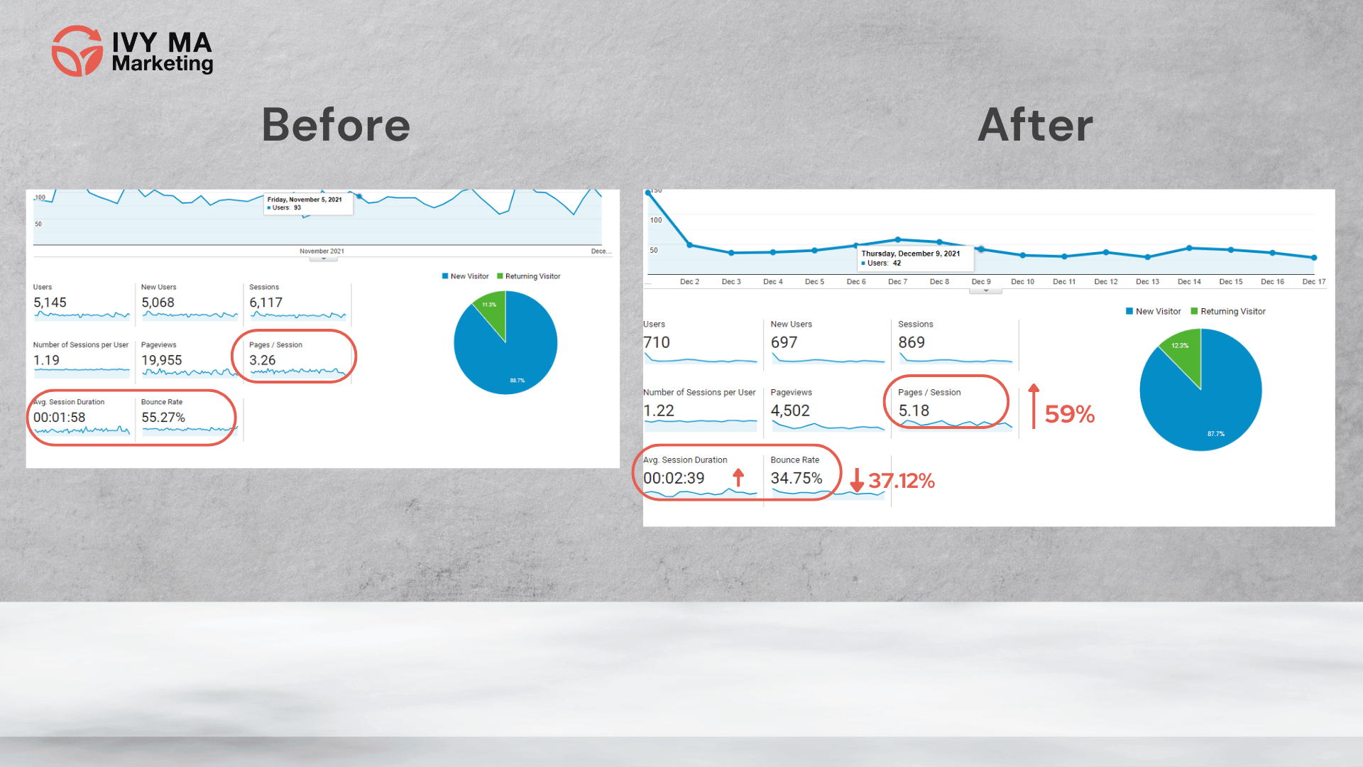
- 60% reduction of the bounce rate within 2 month after launching
Project Background
Client Background: Vancouver Balloons(VB) is an event-based balloon artistry boutique based in Vancouver for over 30 years. It is the most reputable balloon-go-to place locally known for its highest quality balloons and its highly customizable balloon bouquet design.
Challenge: As the boutique’s balloon bouquets gained popularity, the owner noticed that customers often referred to past pre-built balloon arrangements when selecting or modifying colors from product pictures. This led to multiple rounds of communication between staff and customers, resulting in errors due to cultural differences in color perception. Consequently, the business hopes to have an efficient way to provide customers with more convenient options for building balloon bouquets.
Our Approach: I collaborated with VB as a product designer in a 4-person team, primarily focusing on enhancing the UX of the company’s rebranded website. Additionally, I contributed to building the UI design and user experience flow of its new balloon bouquet builder design system, aiming to offer customers more creative options and streamline the color selection process to save their shopping time.
Software Skills
- WordPress
- Adobe Illustrator
- Adobe Photoshop
- Zoom Meeting
- Canva
- Figma
- Slack
-
Microsoft Office/
Office 365 -
Google Workspace/
G Suite
Soft Skills
- User Flow Strategy
- Marketing Research
- Competitor Analysis
- Teamwork
Outcomes
Reduction of the bounce rate
(PS: Lower bounce rate usually means your page is enagaing and useful, learn more about bounce rate at this article)
Times increase in Pages per Session.
(PS: According to research, average pages per session is around 2.6 pages, after optimization ,we reached 5.18 pages, which is a dramatic enhancement.)
Overview
Vancouver Balloons(VB) spent three decades earning a devoted following, all with the word-of-mouth reputation. The owner Isaac was a dedicated and knowledgeable balloon man that cares deeply about his customers.
With the vision of uneasing the shopping experience and serving more customers. Ivy worked together with the VB team to create an innovative digital experience that make customers’ creative ideas come true in a few clicks. Our approach makes the site feel like a natural extension of the brand.
Project Objective
- Enhance the overall user experience for the brand new website
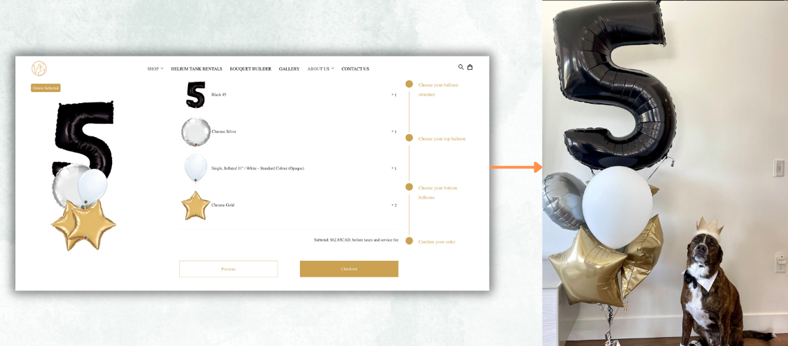
- Design a easy to use bouquet builder for customers
- Enhance in-store sales work efficiency
My Role
UI/UX Designer
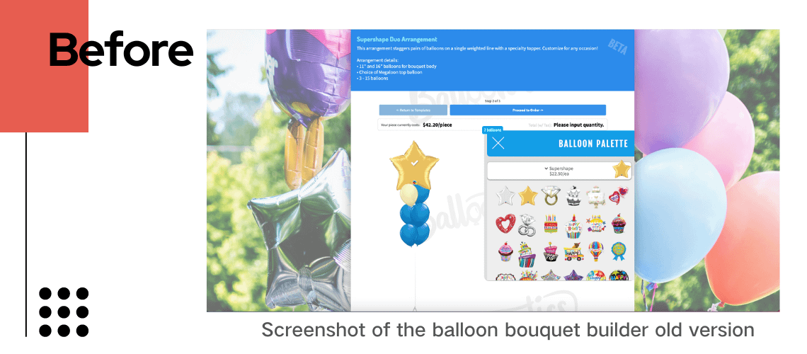
Redesign the Balloon Bouquet Builder(BBB) to be more modern and minimalistic compared to the existing old builder interface, and further enhance the user experience.
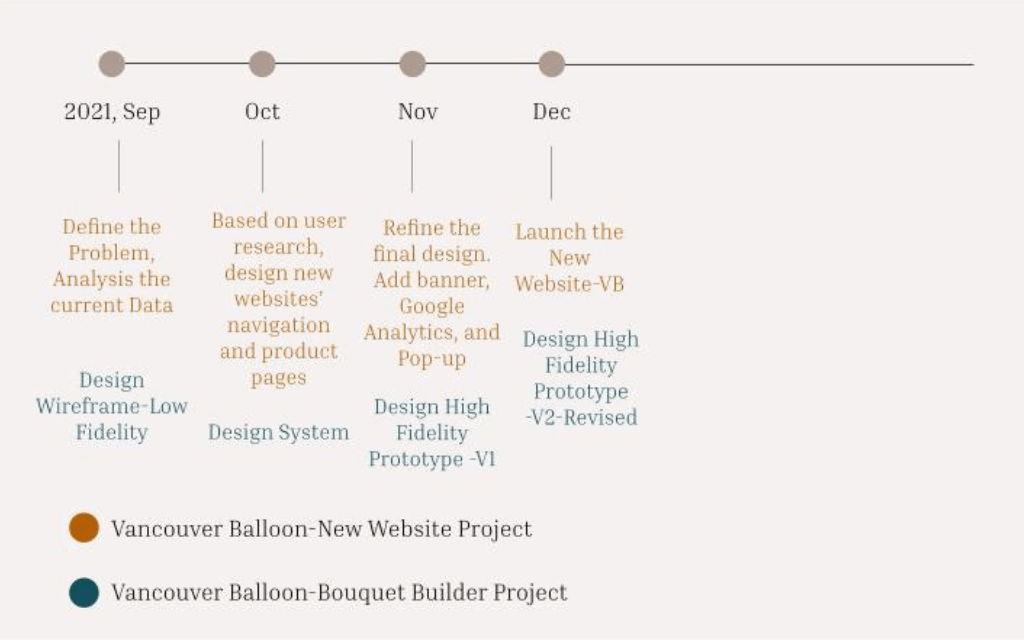
Project Timeline
Research
To better understand the brand’s current online shopping experience, I decide to do some interviews with different users of the website.
So, I reached some in-store staff and some loyal customer’s feedback with focus group, usability testing and one-on-one interview. In total, I received 15 answers.
Main Insights from the interviews
- Users think the menu bar search could be more simplified(e.g, too many display on types of balloons).
- Users believe that the navigation on the site makes them hard to find what they want, as they often see so many pages under one balloon category.
I created an affinity diagram to organize the insights, ideas and problems that I heard during the interviews.
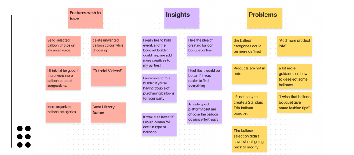
I also received a lot of great ideas for new features that could be good additions to the bouquet builder, but I had to stick with the objective and the focused on what’s most important to solve with limited time for the client🥲.
Persona
After all the inteviews and consulted with in-store staffs, I was ready build a personas who will drive me into the process of user flow and feature designs.
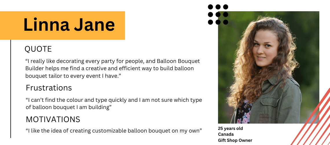
And her frustrations were addressed with this feature:
- When I create my balloon bouquet designs on VB Balloon Bouquet Builder.
- I want to find the balloon types and colors to compose my bouquet easily.
- So I can save more time searching or asking for a specific color.
User Flow
Before starting to design the new interface, I prepared a user flow based on the flow that already existed, with the new feature added on it. Build a balloon bouquet in standard structure.
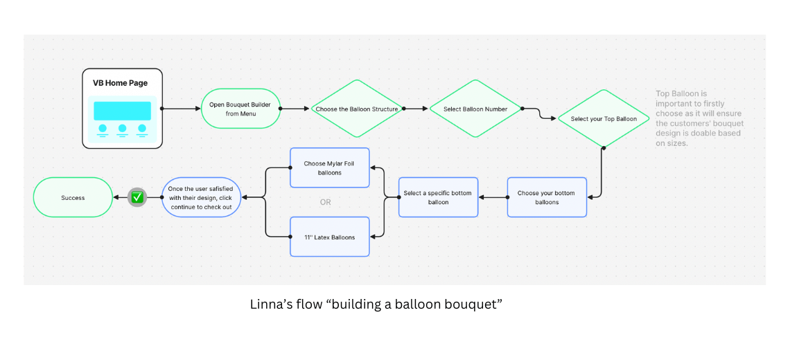
Low Fidelity Prototype to High Fidelity Prototype
I started evolving the Low Fidelity prototype with team and constanly receiving feedback for improving the overall experience.
Highlights
Things that I have changed
- Categorize all the plain color balloons intro different categories;
- Simplified the product category
- Added top bar notification to notify any discount.
Benefits of these changes:
- Optimized the number of product pages, so that customers can save time to find what they want faster.
- Allowing customers to choose colors under one type of balloons, for example, all colors for chrome balloons are laid out under the category product “chrome balloons”, it eliminated any repetitive products and it is easier to manage when updating the new product, simply add a color or add the inventory instead uploading a new product, which consumed lots of uneccessary time for staffs.
Users will need to have a bit of adabtbility as users can only choose the color when they enter into a specific product type page instead of selecting the colors on the products display page.
However, it will reduce the amount of time for user searching for specific balloons color and types and further enhance the overall site user experience in the long term.
Before
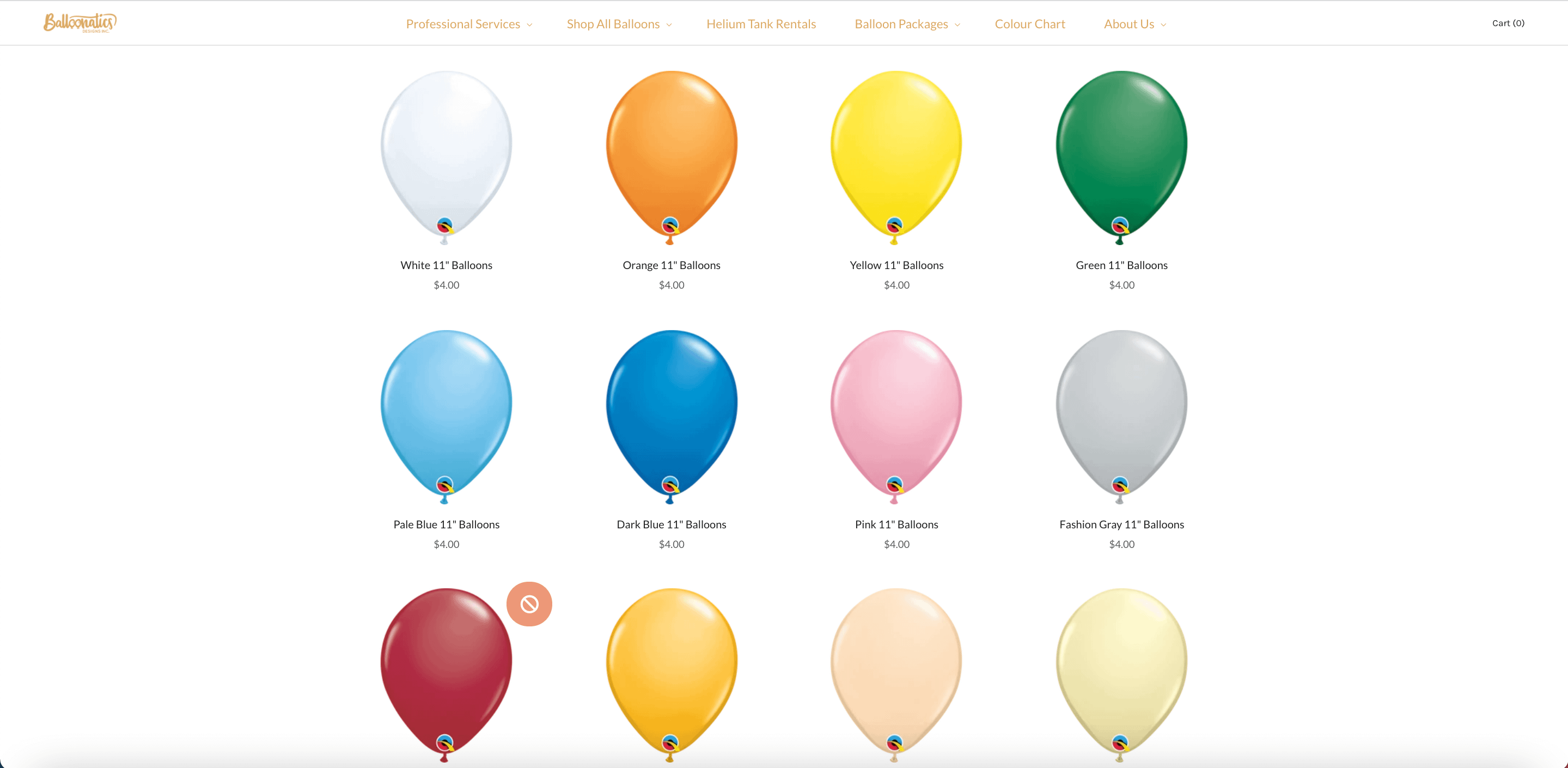
Previous Product Pages
Problem: Different colors under one balloon product type spread out all over the pages and it occupied more than 20 pages.
After
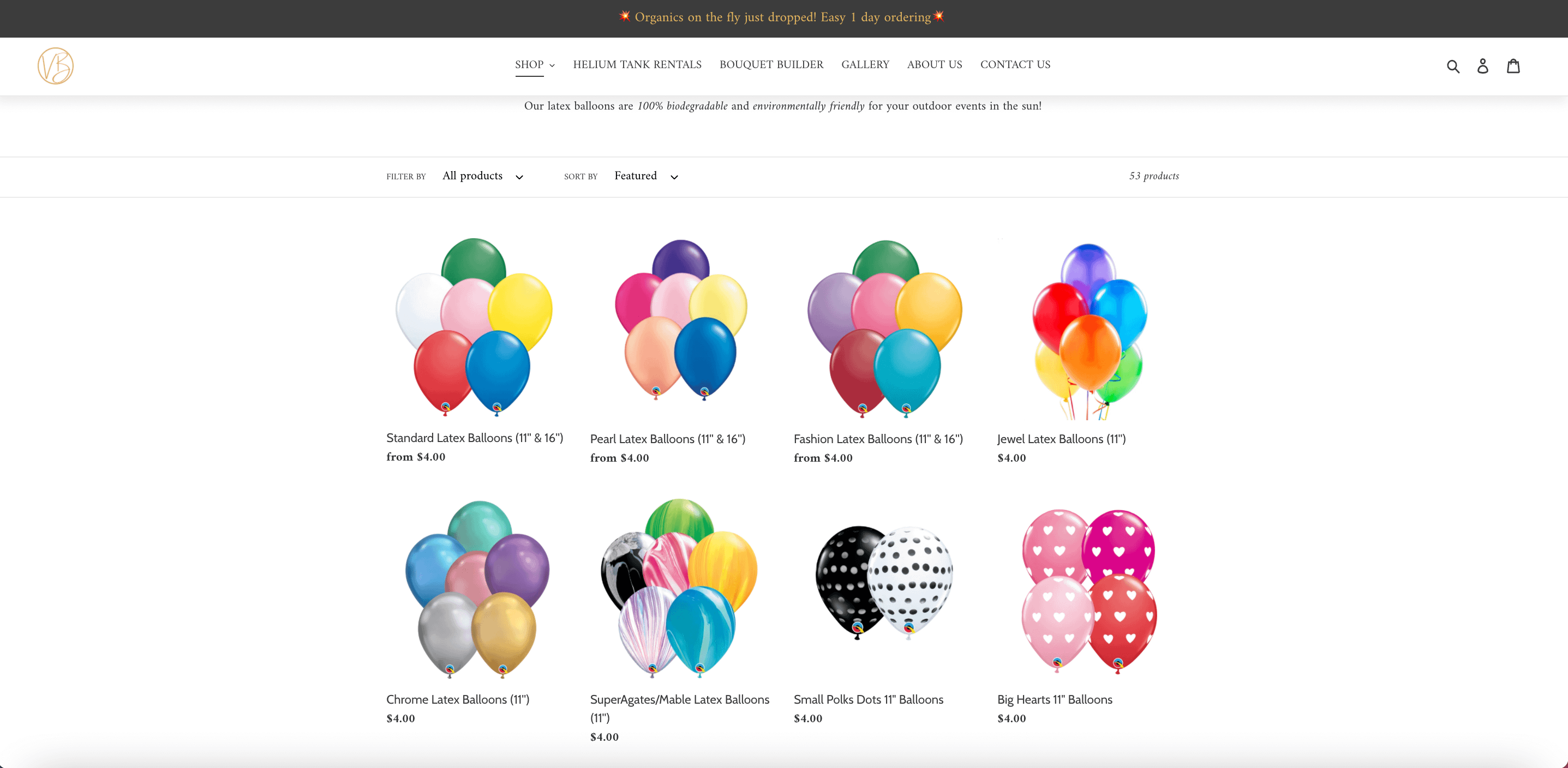
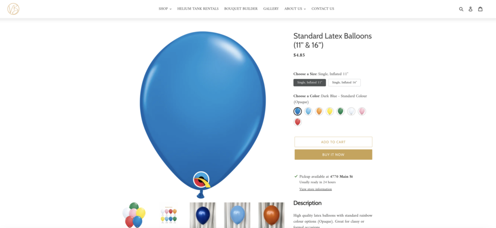
UX Improvement
Solution: I made a color combination product featured images for each balloon types. Also I added the color palette options for online shopping, which there was no such featured before. As a result, it largely enhanced the user experience of the site and increase the page view and user visit duration by 50%.
Final Deliverables
- A rebranded new website built for Vancouver Balloons.
- High fidelity mockup for balloon bouquet customization website.
- New Website Lanching Social Media Post/Video.
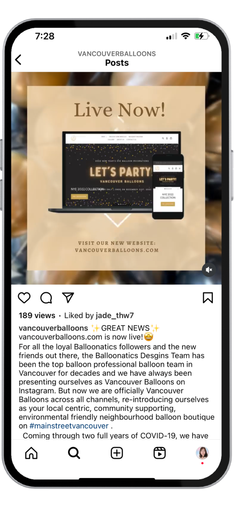
Big Takeaway
This is the 1st real-world project I was involved after finishing the online UX design foundation bootcamp from Designlab, I was so grateful to have chance working with developers and designers to achieve something great together! And it was a valuable project to me
- Saving customers' time is massive value for all parties.
- Always double check with developer to check if the function is doable.
- One of limitation is that the store already using shopify template, there is not much room to modify.
- A project management tool is the best way to boost teamwork efficiency.

